Ghost theme - Part 3: Mobile Layout
Please Note that this theme is not in use anymore. See this post for more info.
Here is the third part of this series where we will dive into creating the proper layout for the posts on the front page and figure out a way to display our layout on mobilephones.
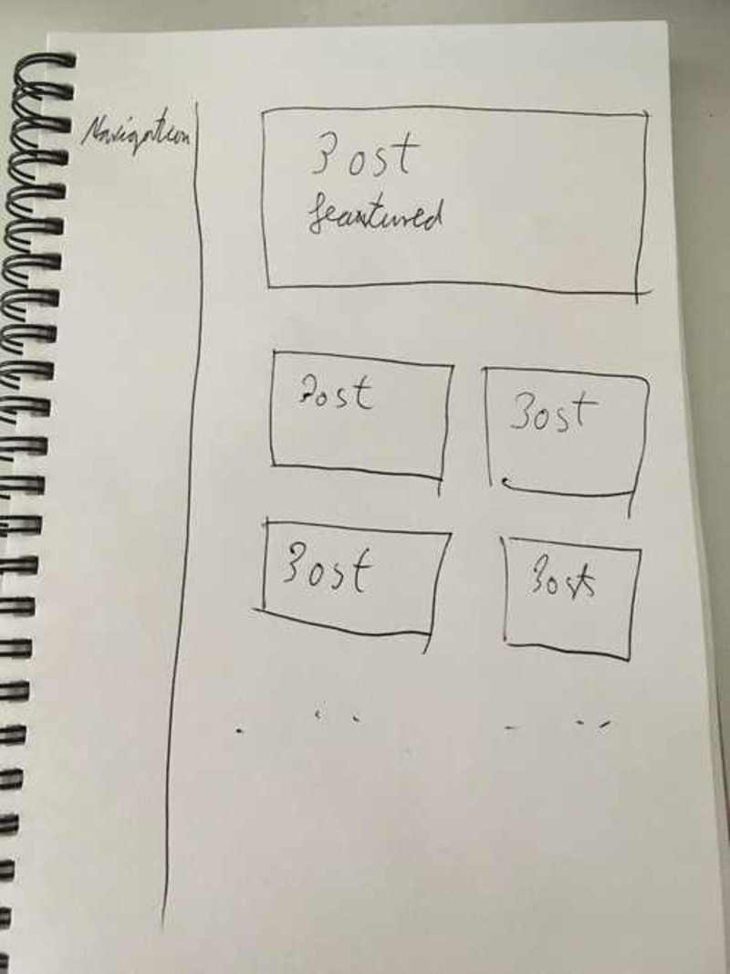
Just in case lets bring up the inital sketch again
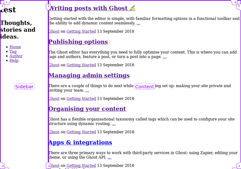
But before we can jump in and take care of the posts we have a small problem.
Using the mobile page preview of the browser we can easily spot it.
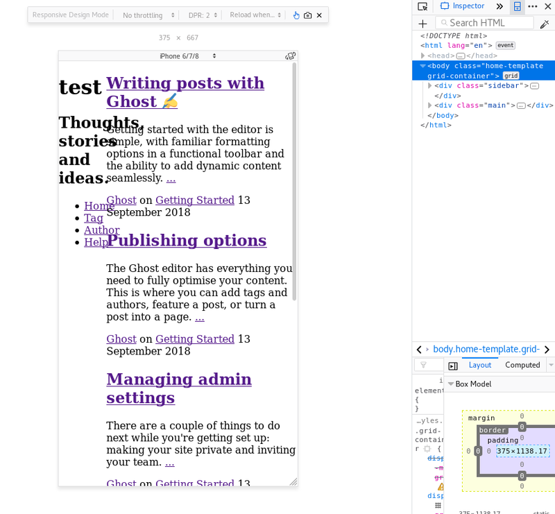
The content inside the sidebar does not fit inside the container anymore. Unfortunately max-width does not help here, as the words are actually too long and the browser cant wrap the text to the next line.
So its time to come up with a new sketch:
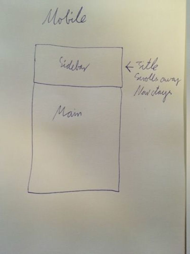
You have probably encountered this technique before. Here is a break down:
- We will make the sidebar go to the top on mobile devices.
- The Title and subtitle will scroll out of the screen
- The navigation elements will stay on top
Implementation
Responsiveness
The first thing I am going to do is to convert the whole layout to this idea.
This ‘old’ design will be wrapped via media-queries that activate when a certain screen-size is reached.
This way of doing it is called mobile first.
Since this theme is in an early stage of development it is still easily possible to switch to this approach.
This is the updated CSS:
variables.css
:root {
  /* Container sizes */
  --main-width: 100vw;
  --main-height: 80vh;

  --sidebar-width: 100vw;
  --sidebar-height: 20vh;
}

@media screen and (min-width: 961px) {
  :root {
    /* Container sizes */
    --main-width: 80vw;
    --main-height: 100%;

    --sidebar-width: 20vw;
    --sidebar-height: 100vh;
  }
}
styles.css
@import "./helpers/variables.css";

/* Mobile */
body {
  margin: 0px;
}

.grid-container {
  display: grid;
  height: 100%;
  grid-template-columns: 1fr;
  grid-template-rows: var(--sidebar-height) var(--main-height);
  grid-gap: 0px;
  grid-template-areas: "Sidebar" "Content";
}

.main {
  grid-area: Content;
  max-width: var(--main-width);
}

.sidebar {
  grid-area: Sidebar;
}


/* Desktop */
@media screen and (min-width: 961px) {
  .grid-container {
    display: grid;
    height: 100%;
    grid-template-columns: var(--sidebar-width) var(--main-width);
    grid-template-rows: 1fr;
    grid-gap: 0px;
    grid-template-areas: "Sidebar Content";
  }
  .main {
    grid-area: Content;
    max-width: var(--main-width);
  }
}
Et voila, we have a responsive page.
The Sidebar
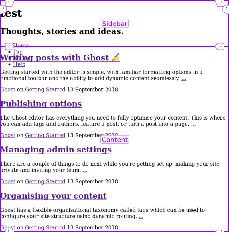
As you can see the content of the Sidebar seems to escape into regions it shouldnt.
To fix this lets first change the default.hbs and remove the <div class="sidebar> and attach that class directly to the <header>.
Back in the styles.css we can now add some rules.
I am going to go for a flexbox solution.
 .sidebar {
  grid-area: Sidebar;
  display: flex;
  flex-wrap: wrap;
  max-height: var(--sidebar-height);
}
- Tell the component that its display type is
flexbox. - Make sure that the content will wrap when it reaches the bounds of this container
- Set a maximum height on the sidebar. To make sure it doesnt grow beyond what we would like to have in our design. This is espacially useful when the sidebar is actually at the side.
Lets leave the additional requirements of hiding the title and subtitle for the next post.
The posts
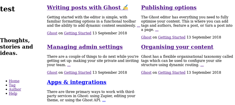
Lastly its time to implement the post layout.
On the mobile front everything looks good already. One post per row.
For the desktop we need to find a way to display 2 posts next to each other though.
First I will create a new file components/index.css that will hold all the styles for the Index page. All the styling until now was for the default.hbs.
Also do not forget to import this file in the styles.css via @import "./components/index.css";.
Here is the CSS that will accomplish the task:
.index__posts {
  display: flex;
  flex-wrap: wrap;

  & .post {
    width: var(--post-width);
  }
}
You can see that the .post class is nested inside the .index__posts class. This again is taken care of during the build step via postcss-preset-env.
The --post-width variable is inside the variables.css file and looks like this:
/* .... */
:root {
  --post-width: var(--main-width);
}

@media screen and (min-width: 961px) {
  :root {
    /* .... */
    --post-width: calc(var(--main-width) / 2);
  }
This works in the following way:
- When the Screen is 961px wide or bigger every post will have the width of half the
--main-width. - Posts are inside a flexbox container
- Since the flexbox container does not wrap by default and instead rezises our posts to fit inside of it, we tell it to wrap the content.
- 2 posts will be shown per ‘row’ :)
The one thing I have not mentioned until now is the CSS calc function, which allows us to dynamically calculate some values.
Wrap up
Phew, this post had quite a lot of content and advanced techniques. Nevertheless the theme is now in a good state with relatively little CSS and should be pretty maintainable and extendable.
The neat little trick with the custom-properties is something that I have added to postcss-custom-properties while writing this, so it might not yet be released. I will update this post once it is.
Here is a final image of the Desktop page, looks pretty good already :
Next post
Whats going to happen in part 4?
Lets fix the Sidebar for mobile layouts. Afterwards in part 5 the Basics should be done to start with Typography and Colours :)